Salesforce commerce cloud has many challenges. One of the challenges is maintaining consistency. When we work with decorators, some temples, or content inside decorators face issues in maintaining consistency. For this SFCC introduced Page Designer. Here will explain information related to Page Designer which is how to set up or how to enable Page Designer in SFCC project so that empower the client/business team to create impactful and beautiful content.
First, see the Benefits of page designer.
Benefits of Page Designer
Whether clients/business teams are using RefArch or SiteGenesis, Page Designer helps to reduce SFCC developer dependency, because of the improving speed of the market and lower the quality assurance time. If a storefront has heavy pages or requires marketing content Page Designer can help elevate productivity by focusing on the key concepts and rules by which the designed pages will work.
By using page designer we can create, drag & drop content, manage pages, preview the current state of the page is in, and create reusable components which will skyrocket the marketing level of your storefront.
Now, see Pre-Requisites of Page Designer
PRE-REQUISITES:
- Access the sandbox and Account Manager and log in to the sandbox.
- Access to SFCC Git hub Library
- Setup workspace in VSCode.
It’s time to see the Anatomy of page designers.
ANATOMY OF A PAGE DESIGNER
When we talk about the anatomy of the Page Designer, three words come layout, page type, and component. These are also the core of Page Designer concept and logic. Let’s see what three words each of them represents so we could have a clear understanding of the entire Page Designer idea. All these files (in file structure VSCode) in page designer represent a code description of a component, together with its logic as an enclosed unit.
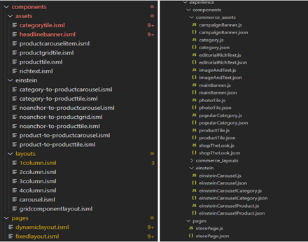
Layouts, Page type, and Assets are three important words.
- Layouts: Custom-made templates, tailored to customers’ requirements and with the potential to be reused. They represent containers in which we will nest your content/assets.
- Page type: We design our page types here. In the picture, you can see there are fixed layouts and dynamic layouts. This is where we define the main purpose of the page.
- Assets: Pieces of content, made to be as modular as possible so they can represent their use in the best possible way in a closed-up segment (product tile, grid tile, layout element… ).
In the right picture, there are descriptions of your components or pages, .json defining their attribute groups, regions, and component types that are allowed to be embedded inside a layout/page. While .js defines the render function, the way your component/page will be rendered, and with what properties, data, links, rules, etc., and since rendering returns the actual markup of the page, this method is mandatory.
The actual look of the components is done through styling, CSS, and aligning our layout as we see fit.
BUILDING A CUSTOM PAGE TYPE WITH COMPONENTS
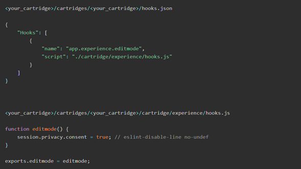
To start this customization, I will add hooks.json to my cartridge with the following hook and, afterwards, I will define the page designer hook.js which will return info if a page is in edit mode:
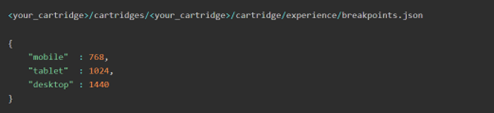
The next important thing we need to do is add breakpoints.json for the responsive part of the page:
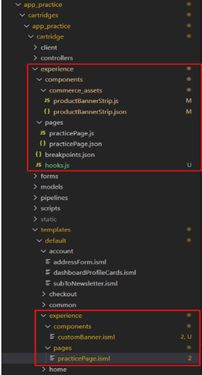
The hierarchy in your file folders should look like this:
First thing is that we need a custom page type. So, first, we have to add the following files and the following is an explanation of what is happening:
1. We need a template for our custom page type:
practicePage.isml
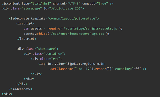
Here, we used a pdStorePage decorator and CSS for it from the core, so that it looks decent :
Notice that our <isprint> tag has reference to the main region from its meta description in the following file:
2. We need a meta description for our custom page type:
practicePage.json
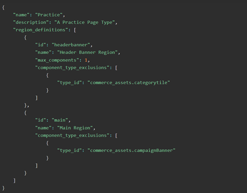
In the above image, the property component_type_exclusions is there to exclude specific component types from this region. This way you are provided with clean options inside Page Designer of what you are even able to add inside the region of interest. It lowers the possibility of error and increases the efficiency of the person responsible for designing this page.
In the above image, the max_components determines how many components can fit into a specified region. For instance,
The main region doesn’t contain the max_components property. That way it can have as many regions as an SFCC developer needs. Otherwise, we can make a limit to your regions as it will make content managers’ jobs and our job much easier.
If you want to have a specific region type, you can do so by adding a type to this JSON meta definition file. On the page designer type already has some default predefined values included.
category, cms_record, custom, file, image, page, product
These following types also correspond with actual B2C Commerce API (Application programming interface) Value Objects
dw.catalog.Category,
dw.experience.CMSRecord,
dw.util.Map,
dw.content.MediaFile,
dw.experience.image.Image,
dw.experience.Page,
dw.catalog.Product
The PD (Page Designer) has most of the region types already by default defined. These regions can also be custom.
3. And last but not least, we need a script file that defines the render function of this page type
practicePage.js
‘use strict’;
const Template = require(‘dw/util/Template’);
const HashMap = require(‘dw/util/HashMap’);
const PageRenderHelper = require(‘*/cartridge/experience/utilities/PageRenderHelper.js’);
const RegionModelRegistry = require(‘*/cartridge/experience/utilities/RegionModelRegistry.js’);
/**
* Render logic for the practice page that we want to design.
* @param {dw.experience.PageScriptContext} context it is the page script context object.
* @returns {string} The template text
*/
module.exports.render = function (context) {
const model = new HashMap();
const page = context.page;
model.page = page; // automatically register configured regions
const metaDefinition = require(‘*/cartridge/experience/pages/practicePage.json’);
model.regions = new RegionModelRegistry(page, metaDefinition);
// Determine seo meta data.
// Used in code in htmlHead.isml via common/layout/page.isml decorator.
model.CurrentPageMetaData = {};
model.CurrentPageMetaData.title = page.pageTitle;
model.CurrentPageMetaData.description = page.pageDescription;
model.CurrentPageMetaData.keywords = page.pageKeywords;
if (PageRenderHelper.isInEditMode()) {
const HookManager = require(‘dw/system/HookMgr’);
HookManager.callHook(‘app.experience.editmode’, ‘editmode’);
model.resetEditPDMode = true;
}
// render the page
return new Template(‘experience/pages/practicePage’).render(model).text;
};
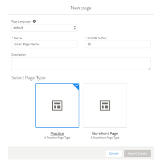
If we are done with page type implementation, then and then only we should be able to see it in the page designer inside your Business Manager when we start creating a new page.
BUILDING A CUSTOM COMPONENT
Let’s start making a custom banner that will contain an image that we want to display inside a container.
Clicking on that link below the banner would jump to a product page.
For this, we need an image, alt (alternative text) for that image, and an actual product to which we want to navigate and display on a storefront.
Which image we want to upload will be a type of file. alt will be a type of string. That product will be a type of product.
Let’s start by defining our component, inside a JSON meta-file
productBannerStrip.json
{
“name”: “Custom Banner”,
“description”: “This is a banner component.”,
“group”: “commerce_assets”,
“attribute_definition_groups”: [
{
“id”: “bannerSpec”,
“name”: “BannerSpecification”,
“description”: ” Text that you want to describe”,
“attribute_definitions”: [
{
“id”: “image”,
“name”: “Banner Image”,
“description”: ” Text that you want to describe”,
“type”: “file”,
“required”: true
},
{
“id”: “alt”,
“name”: “Banner Image Alt Text”,
“description”: “Text that you want to describe”,
“type”: “string”,
“required”: false
},
{
“id”: “product”,
“name”: “Product ID”,
“description”: ” Text that you want to describe “,
“type”: “product”,
“required”: true
}
]
}
],
“region_definitions”: []
}
1. After this, we need a template that will represent our embedded component content.
customBanner.isml
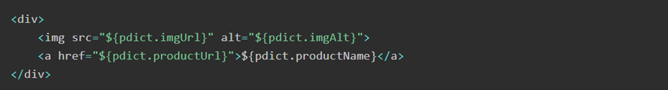
It is important to keep it simple in the template so that it’s clear what’s happening.
2. And, finally, we need the script file with the render function so that we can know what these parameters in customBanner.isml are.
productBannerStrip.js
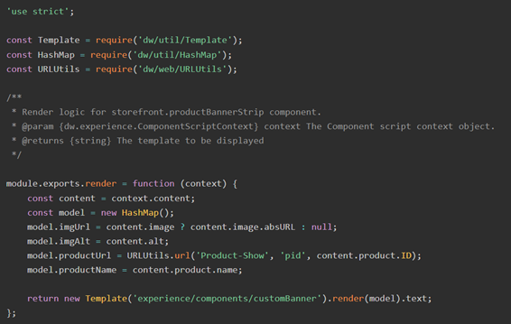
In above code shows the context in the render function represents the editor inside the Page Designer. By requiring context.the content we can access the parameters which we defined in the meta description JSON file which is above shown.
The above code shows the render () function. It is a mandatory function. This render() function represents the method that will fire off when the element needs to be rendered in Page Designer. It takes the dw.util.Template. It sends a model with data to render.
After performing all these steps, we should be able to add a component to our page designer. We will find our Custom Banner in offered components to add:
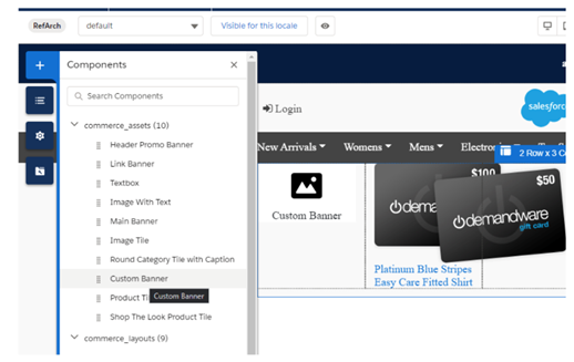
After we drag & drop the component into the layer, there will be an overlay at your right with the details which you defined in .json of your component. It will follow the rules of that JSON (this required attribute helps a lot in controlling unwanted errors).
The components will be available so that we can add them in each region that didn’t explicitly exclude that component type.
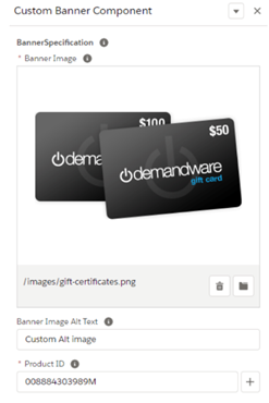
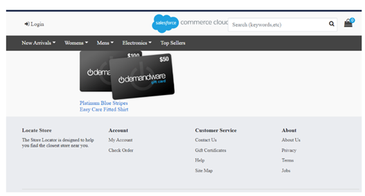
Click on Save on component and it is going into a Preview mode in the top right corner. We will see our banner, with an active link to the Product detail page.
What happens when we need a component type that doesn’t have an already predefined type?
We shouldn’t flinch. The Page Designer supports implementation for Custom Attribute Editor, where we can specify everything that we need for our custom implementation.
WRAP UP
Page Designer is a relatively new tool introduced in the summer of 2019 in SFCC. If we need a way to make more consistent, personalized content, a compact Page Designer is a way to go.
Hopefully, the above information will guide you with enough knowledge and insights into how things are set up and how they work in SFCC.
Thanks for reading this Blog.